

 Learn about electronic charts and decide which one is for you. Mariners Learning System breaks down the difference between raster and vector charts. In much the same way as a fax machine scans a document that is about to be sent. The chart is broken down into a vast number of tiny dots (pixels), and the position and color of each pixel is recorded. Instead of sending this information down a telephone line, as a fax machine does, the chart scanner stores it on the cartographer’s computer, from where it can be copied onto flash memory cards or CD-ROMS, and supplied to customers.
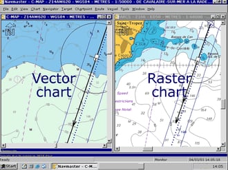
Raster charts are relatively cheap and simple to make, but each chart uses a lot of memory or disc space. Because they are electronically copied straight from the paper chart, they are familiar in appearance, and contain exactly the same information: nothing is added or taken away. The drawback is that they can only be used effectively at about the same scale as the original chart: if you zoom in, then letters and symbols become huge, but without any extra detail becoming visible; while if you zoom out, names and symbols become illegible.
Vector charts are produced by electronically tracing raster charts. The fundamental difference is that lines are not stored as strings of darkened pixels, but as lines. Vector charts originally became popular for small boat hardware plotters because although they are more expensive to produce, they occupy much less memory. The vector format also allows more flexibility in the way the chart is used: a vector chart can be zoomed in or out much further than a raster chart, but the letters and symbols always stay the same size.
On a raster based chart, a feature such as a buoy is represented by a cluster of colored pixels that make up the shape of a buoy symbol exactly as it appears on the original paper chart. On a vector chart, however, the buoy’s position is linked to a database of information about the buoy. The software can use this database in various ways. Some programs will represent all navigation aids by means of the same diamond-shaped symbol. When you select one (by ‘pointing at it’ with the cursor) the data is revealed in a text panel somewhere on the screen. Other systems use the database information to display a symbol showing the shape and color of the buoy itself.
More sophisticated versions of this are used on some electronic charts to provide graphic representations of the changing height of tide at particular places, to provide additional information such as lists of port facilities, or to superimpose arrows showing the tidal stream on top of the main chart.


Let Us Know What You Thought about this Post.
Put your Comment Below.